import pandas as pd

pd.set_option("display.max_rows", 5)2장 - 무작위 실험 및 기초 통계 리뷰
2.1 무작위 배정으로 독립성 확보하기
2.2 A/B 테스트 사례
실제 산업 현장에서 무작위 실험은 A/B 테스트라는 이름으로 널리 사용됩니다. 새로운 기능을 도입하기 전, 일부 사용자에게만 노출하여 효과를 정밀하게 측정합니다.
import pandas as pd  # for data manipulation
import numpy as np  # for numerical computation

data = pd.read_csv("../data/cross_sell_email.csv")
data| gender | cross_sell_email | age | conversion | |
|---|---|---|---|---|
| 0 | 0 | short | 15 | 0 |
| 1 | 1 | short | 27 | 0 |
| ... | ... | ... | ... | ... |
| 321 | 1 | no_email | 16 | 0 |
| 322 | 1 | long | 24 | 1 |
323 rows × 4 columns
(data.groupby(["cross_sell_email"]).mean())| gender | age | conversion | |
|---|---|---|---|
| cross_sell_email | |||
| long | 0.550459 | 21.752294 | 0.055046 |
| no_email | 0.542553 | 20.489362 | 0.042553 |
| short | 0.633333 | 20.991667 | 0.125000 |
X = ["gender", "age"]

mu = data.groupby("cross_sell_email")[X].mean()
var = data.groupby("cross_sell_email")[X].var()

norm_diff = (mu - mu.loc["no_email"]) / np.sqrt((var + var.loc["no_email"]) / 2)

norm_diff| gender | age | |
|---|---|---|
| cross_sell_email | ||
| long | 0.015802 | 0.221423 |
| no_email | 0.000000 | 0.000000 |
| short | 0.184341 | 0.087370 |
2.3 이상적인 실험
이상적인 실험에서는 모든 외생 변수가 통제되며, 오직 처치 변수만이 결과에 영향을 미칩니다.
2.4 가장 위험한 수식
import warnings

warnings.filterwarnings("ignore")

import pandas as pd
import numpy as np
from scipy import stats
import seaborn as sns
from matplotlib import pyplot as plt
from cycler import cycler
import matplotlib

default_cycler = cycler(color=["0.1", "0.5", "1.0"])

color = ["0.3", "0.5", "0.7", "0.9"]
linestyle = ["-", "--", ":", "-."]
marker = ["o", "v", "d", "p"]

plt.rc("axes", prop_cycle=default_cycler)

matplotlib.rcParams.update({"font.size": 18})
df = pd.read_csv("data/enem_scores.csv")
df.sort_values(by="avg_score", ascending=False).head(10)| year | school_id | number_of_students | avg_score | |
|---|---|---|---|---|
| 16670 | 2007 | 33062633 | 68 | 82.97 |
| 16796 | 2007 | 33065403 | 172 | 82.04 |
| ... | ... | ... | ... | ... |
| 14636 | 2007 | 31311723 | 222 | 79.41 |
| 17318 | 2007 | 33087679 | 210 | 79.38 |
10 rows × 4 columns
plot_data = df.assign(top_school=df["avg_score"] >= np.quantile(df["avg_score"], 0.99))[
    ["top_school", "number_of_students"]
].query(
    f"number_of_students<{np.quantile(df['number_of_students'], 0.98)}"
)  # remove outliers

plt.figure(figsize=(8, 4))
ax = sns.boxplot(x="top_school", y="number_of_students", data=plot_data)

plt.title("Number of Students of 1% Top Schools (Right)")
Text(0.5, 1.0, 'Number of Students of 1% Top Schools (Right)')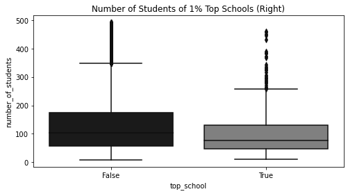
q_99 = np.quantile(df["avg_score"], 0.99)
q_01 = np.quantile(df["avg_score"], 0.01)

plot_data = df.sample(10000).assign(
    Group=lambda d: np.select(
        [(d["avg_score"] > q_99) | (d["avg_score"] < q_01)],
        ["Top and Bottom"],
        "Middle",
    )
)
plt.figure(figsize=(10, 5))
sns.scatterplot(
    y="avg_score",
    x="number_of_students",
    data=plot_data.query("Group=='Middle'"),
    label="Middle",
)
ax = sns.scatterplot(
    y="avg_score",
    x="number_of_students",
    data=plot_data.query("Group!='Middle'"),
    color="0.7",
    label="Top and Bottom",
)

plt.title("ENEM Score by Number of Students in the School")
Text(0.5, 1.0, 'ENEM Score by Number of Students in the School')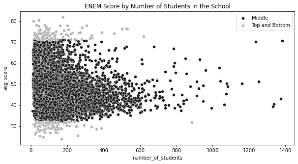
2.5 추정값의 표준오차
추정된 처치 효과가 우연에 의한 것인지 아닌지를 판단하기 위해 표준오차(Standard Error)를 계산합니다. 표본의 크기가 클수록 추정값의 불확실성은 줄어듭니다.
data = pd.read_csv("../data/cross_sell_email.csv")

short_email = data.query("cross_sell_email=='short'")["conversion"]
long_email = data.query("cross_sell_email=='long'")["conversion"]
email = data.query("cross_sell_email!='no_email'")["conversion"]
no_email = data.query("cross_sell_email=='no_email'")["conversion"]

data.groupby("cross_sell_email").size()
cross_sell_email
long 109
no_email 94
short 120
dtype: int64def se(y: pd.Series):
return y.std() / np.sqrt(len(y))
print("SE for Long Email:", se(long_email))
print("SE for Short Email:", se(short_email))SE for Long Email: 0.021946024609185506
SE for Short Email: 0.030316953129541618print("SE for Long Email:", long_email.sem())
print("SE for Short Email:", short_email.sem())SE for Long Email: 0.021946024609185506
SE for Short Email: 0.0303169531295416182.6 신뢰구간
n = 100
conv_rate = 0.08


def run_experiment():
    return np.random.binomial(1, conv_rate, size=n)


np.random.seed(42)

experiments = [run_experiment().mean() for _ in range(10000)]plt.figure(figsize=(10, 4))
freq, bins, img = plt.hist(experiments, bins=20, label="Experiment Means", color="0.6")
plt.vlines(
conv_rate,
ymin=0,
ymax=freq.max(),
linestyles="dashed",
label="True Mean",
color="0.3",
)
plt.legend()<matplotlib.legend.Legend at 0x7fd451a4bc10>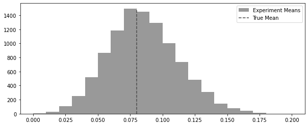
np.random.seed(42)
plt.figure(figsize=(10, 4))
plt.hist(np.random.binomial(1, 0.08, 100), bins=20)
(array([92., 0., 0., 0., 0., 0., 0., 0., 0., 0., 0., 0., 0.,
0., 0., 0., 0., 0., 0., 8.]),
array([0. , 0.05, 0.1 , 0.15, 0.2 , 0.25, 0.3 , 0.35, 0.4 , 0.45, 0.5 ,
0.55, 0.6 , 0.65, 0.7 , 0.75, 0.8 , 0.85, 0.9 , 0.95, 1. ]),
<BarContainer object of 20 artists>)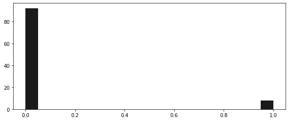
x = np.linspace(-4, 4, 100)
y = stats.norm.pdf(x, 0, 1)

plt.figure(figsize=(10, 4))
plt.plot(x, y, linestyle="solid")
plt.fill_between(x.clip(-3, +3), 0, y, alpha=0.5, label="~99.7% mass", color="C2")
plt.fill_between(x.clip(-2, +2), 0, y, alpha=0.5, label="~95% mass", color="C1")
plt.fill_between(x.clip(-1, +1), 0, y, alpha=0.5, label="~68% mass", color="C0")
plt.ylabel("Density")
plt.legend()
<matplotlib.legend.Legend at 0x7fd451c295d0>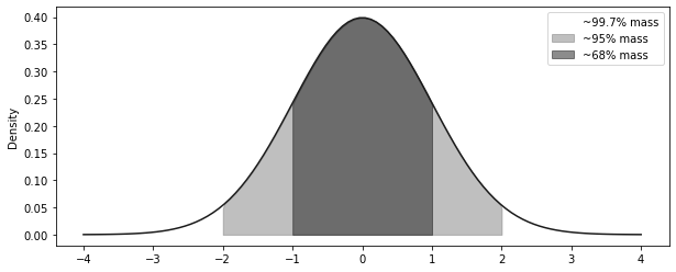
exp_se = short_email.sem()
exp_mu = short_email.mean()
ci = (exp_mu - 2 * exp_se, exp_mu + 2 * exp_se)
print("95% CI for Short Email: ", ci)
95% CI for Short Email: (0.06436609374091676, 0.18563390625908324)x = np.linspace(exp_mu - 4 * exp_se, exp_mu + 4 * exp_se, 100)
y = stats.norm.pdf(x, exp_mu, exp_se)
plt.figure(figsize=(10, 4))
plt.plot(x, y, lw=3)
plt.vlines(ci[1], ymin=0, ymax=4, ls="dotted")
plt.vlines(ci[0], ymin=0, ymax=4, ls="dotted", label="95% CI")
plt.xlabel("Conversion")
plt.legend()<matplotlib.legend.Legend at 0x7fd46289cdd0>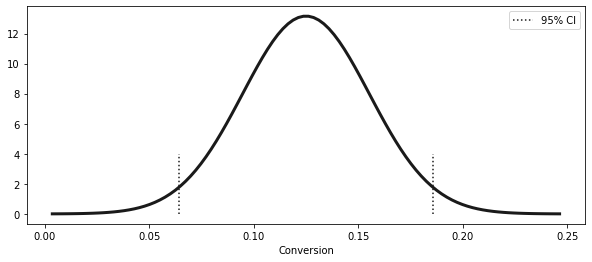
from scipy import stats

z = np.abs(stats.norm.ppf((1 - 0.99) / 2))
print(z)
ci = (exp_mu - z * exp_se, exp_mu + z * exp_se)
ci2.5758293035489004(0.04690870373460816, 0.20309129626539185)stats.norm.ppf((1 - 0.99) / 2)-2.5758293035489004x = np.linspace(exp_mu - 4 * exp_se, exp_mu + 4 * exp_se, 100)
y = stats.norm.pdf(x, exp_mu, exp_se)
plt.figure(figsize=(10, 4))
plt.plot(x, y, lw=3)
plt.vlines(ci[1], ymin=0, ymax=4, ls="dotted")
plt.vlines(ci[0], ymin=0, ymax=4, ls="dotted", label="99% CI")
ci_95 = (exp_mu - 1.96 * exp_se, exp_mu + 1.96 * exp_se)
plt.vlines(ci_95[1], ymin=0, ymax=4, ls="dashed")
plt.vlines(ci_95[0], ymin=0, ymax=4, ls="dashed", label="95% CI")
plt.xlabel("Conversion")
plt.legend()<matplotlib.legend.Legend at 0x7fd462983b50>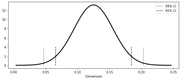
def ci(y: pd.Series):
    return (y.mean() - 2 * y.sem(), y.mean() + 2 * y.sem())


print("95% CI for Short Email:", ci(short_email))
print("95% CI for Long Email:", ci(long_email))
print("95% CI for No Email:", ci(no_email))
95% CI for Short Email: (0.06436609374091676, 0.18563390625908324)
95% CI for Long Email: (0.01115382234126202, 0.09893792077800403)
95% CI for No Email: (0.0006919679286838468, 0.08441441505003955)plt.figure(figsize=(10, 4))
x = np.linspace(-0.05, 0.25, 100)
short_dist = stats.norm.pdf(x, short_email.mean(), short_email.sem())
plt.plot(x, short_dist, lw=2, label="Short", linestyle=linestyle[0])
plt.fill_between(
x.clip(ci(short_email)[0], ci(short_email)[1]),
0,
short_dist,
alpha=0.2,
color="0.0",
)
long_dist = stats.norm.pdf(x, long_email.mean(), long_email.sem())
plt.plot(x, long_dist, lw=2, label="Long", linestyle=linestyle[1])
plt.fill_between(
x.clip(ci(long_email)[0], ci(long_email)[1]), 0, long_dist, alpha=0.2, color="0.4"
)
no_email_dist = stats.norm.pdf(x, no_email.mean(), no_email.sem())
plt.plot(x, no_email_dist, lw=2, label="No email", linestyle=linestyle[2])
plt.fill_between(
x.clip(ci(no_email)[0], ci(no_email)[1]), 0, no_email_dist, alpha=0.2, color="0.8"
)
plt.xlabel("Conversion")
plt.legend()<matplotlib.legend.Legend at 0x7fd451a96810>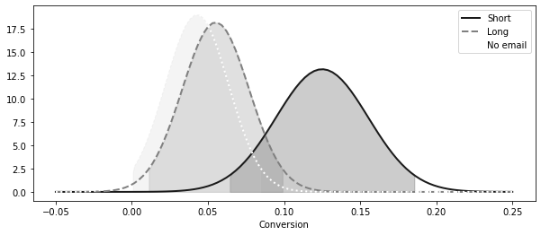
2.7 가설검정
import seaborn as sns
from matplotlib import pyplot as plt

np.random.seed(123)

n1 = np.random.normal(4, 3, 30000)
n2 = np.random.normal(1, 4, 30000)
n_diff = n2 - n1

plt.figure(figsize=(10, 4))
sns.distplot(
    n1, hist=False, label="$N(4,3^2)$", color="0.0", kde_kws={"linestyle": linestyle[0]}
)
sns.distplot(
    n2, hist=False, label="$N(1,4^2)$", color="0.4", kde_kws={"linestyle": linestyle[1]}
)
sns.distplot(
    n_diff,
    hist=False,
    label="$N(-3, 5^2) = N(1,4^2) - (4,3^2)$",
    color="0.8",
    kde_kws={"linestyle": linestyle[1]},
)
plt.legend();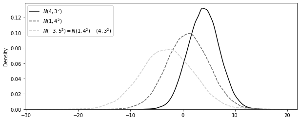
diff_mu = short_email.mean() - no_email.mean()
diff_se = np.sqrt(no_email.sem() ** 2 + short_email.sem() ** 2)

ci = (diff_mu - 1.96 * diff_se, diff_mu + 1.96 * diff_se)
print(f"95% CI for the differece (short email - no email):\n{ci}")
95% CI for the differece (short email - no email):
(0.01023980847439844, 0.15465380854687816)x = np.linspace(diff_mu - 4 * diff_se, diff_mu + 4 * diff_se, 100)
y = stats.norm.pdf(x, diff_mu, diff_se)
plt.figure(figsize=(10, 3))
plt.plot(x, y, lw=3)
plt.vlines(ci[1], ymin=0, ymax=4, ls="dotted")
plt.vlines(ci[0], ymin=0, ymax=4, ls="dotted", label="95% CI")
plt.xlabel("Diff. in Conversion (Short - No Email)\n")
plt.legend()
plt.subplots_adjust(bottom=0.15)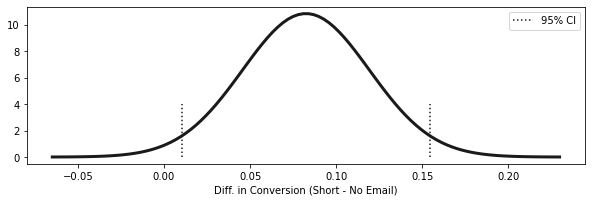
2.7.1 귀무가설
# shifting the CI
diff_mu_shifted = short_email.mean() - no_email.mean() - 0.01
diff_se = np.sqrt(no_email.sem() ** 2 + short_email.sem() ** 2)

ci = (diff_mu_shifted - 1.96 * diff_se, diff_mu_shifted + 1.96 * diff_se)
print(f"95% CI 1% difference between (short email - no email):\n{ci}")
95% CI 1% difference between (short email - no email):
(0.00023980847439844521, 0.14465380854687815)2.7.2 검정통계량
t_stat = (diff_mu - 0) / diff_se
t_stat2.23795123187153642.8 p 값
x = np.linspace(-4, 4, 100)
y = stats.norm.pdf(x, 0, 1)

plt.figure(figsize=(10, 4))
plt.plot(x, y, lw=2)
plt.vlines(t_stat, ymin=0, ymax=0.1, ls="dotted", label="T-Stat", lw=2)
plt.fill_between(x.clip(t_stat), 0, y, alpha=0.4, label="P-value")
plt.legend()
<matplotlib.legend.Legend at 0x7fd462fd6650>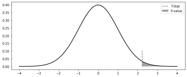
print("P-value:", (1 - stats.norm.cdf(t_stat)) * 2)P-value: 0.0252242355621521422.9 검정력
stats.norm.cdf(0.84)0.79954580673955032.10 표본 크기 계산
# in the book it is np.ceil(16 * no_email.std()**2/0.01), but it is missing the **2 in the denominator.
np.ceil(16 * (no_email.std() / 0.08) ** 2)103.0data.groupby("cross_sell_email").size()cross_sell_email
long 109
no_email 94
short 120
dtype: int64